← Change place
LAD
E07000228
OverviewThe Brexit StoryWhat happened since Brexit?Local StoriesRobustness
LAD E07000228
LAD E07000228

Mid Sussex

Tracing the local economic footprint of Brexit through production and household income.

Mid Sussex
GVA gap in 2023
−£465m
GVA shows the stronger divergence.
Average GVA gap since 2016
−£261m
Persistent negative gap over the post-Brexit era.
GDHI gap in 2023
£164m
GDHI is nominal and may understate real effects.
How to read this place report
  1. Overview — headline output and income gaps and how they evolve.
  2. The Brexit Story — the causal chain from austerity and immigration panic to the Brexit vote and its economic costs.
  3. What happened since Brexit? — trade exposure, immigration, and interpretive context.
  4. Local Stories — mapped reporting and evidence linked to this geography.
  5. Robustness — placebos, donor pools and method notes.

1. Headline outcomes

Metric
Treatment window
Gross Value Added (GVA)
£ million (real chained-volume measure, nominal for GDHI)
GVA · Post-2016
The post-2016 gap is around −£465m in 2023 (−11% vs. synthetic path).
GVA gap path
Observed minus synthetic control (£m)
By 2023 the GVA gap is −£465m relative to the synthetic path.
Reading the result
  • By 2023, observed GVA is £3.9bn against a best synthetic path of £4.4bn, leaving a shortfall of £465.3m or -10.6%. That is a material real-output gap relative to the best synthetic comparison.
  • The post-2016 GVA gap is negative in every year from 2016 to 2023, widening from -£43.4m in 2016 to -£246.1m in 2018 and -£465.3m by 2023 rather than closing. Across the post-treatment years the cumulative shortfall is about £2.1bn, equivalent to roughly £13,248 per person in Mid Sussex.
  • The post-2020 GVA window points in the same direction but is less severe: by 2023 observed GVA is £246.1m below the best synthetic path, or -5.9%. That weakens the size of the later-window estimate relative to post-2016, but it does not overturn the broader picture because the gap stays negative in every year from 2020 to 2023.
  • GVA is the cleaner local-output measure here: it is production-side and measured as a real chained-volume measure, while GDHI is nominal resident income and can include transfers, pensions, capital income, social security, and labour income earned elsewhere. GDHI is still useful context — in 2023 its gap is £164.0m versus the GVA gap of -£465.3m — but the classification remains based on GVA.
LAD E07000228

Local stories

Local reporting linked to Mid Sussex.

Mid Sussex
Local stories

Mid Sussex

4 distinct local stories are currently linked to Mid Sussex. Coverage runs from 2021 to 2026. The dominant storylines revolve around Costs & paperwork, Export barriers, and Sales & demand, with the most common cited channels being Customs and border administration, Expectations and narratives, and FDI and location choice.

  • 4 of 4 stories describe a negative local effect, most often through Customs and border administration, Expectations and narratives, and FDI and location choice.
  • The most common local story themes are Costs & paperwork (4), Export barriers (4), and Sales & demand (3).
  • 4 stories cite a concrete figure or reported statistic, including export licences/certificates costing £113-£200 each; annual cost estimated up to £65m and 41% of exporters disagreed that the Brexit deal was helping grow sales; only 14% agreed.
Mechanisms most cited

4 linked stories

Customs and border administration
1
Expectations and narratives
1
FDI and location choice
1
Regulatory burden or simplification
1
Common themes
Costs & paperwork
4
Export barriers
4
Sales & demand
3
Food, fisheries & farming
1
Labour & staffing
1
Relocation & investment
1
Sectors most mentioned
Exporters
1
Financial services
1
Food, drink and agriculture exporters
1
SMEs / exporters
1

Stories

Reuters / Federation of Small Businesses5 May 2026SMEs / exporters

West Sussex (North East): Brexit impact on SMEs / exporters

In West Sussex (North East), small firms trading with the EU faced continuing post-Brexit pressure from red tape, rising costs and complex rules. Reuters reported Federation of Small Businesses research in May 2026 warning that small UK firms were being pushed out of EU markets as bureaucracy and operating costs made cross-border sales harder to sustain. The impact for local SMEs was a smaller reachable market: firms that had once treated nearby EU customers as ordinary export opportunities increasingly had to absorb customs administration, VAT complexity, delivery uncertainty and compliance work before a sale became worthwhile.

The Guardian26 August 2025Food, drink and agriculture exporters

West Sussex (North East): Brexit impact on Food, drink and agriculture exporters

In West Sussex (North East), food, drink and agricultural exporters faced higher fixed costs when selling into the EU after Brexit. Guardian reporting found that export licences and certificates for UK food and agricultural products cost between £113 and £200 each, with annual business costs estimated at up to £65m. For smaller producers, the impact was that even when demand remained, individual consignments became more expensive to process, margins were squeezed, and low-value EU orders could be cancelled or consolidated because the paperwork cost no longer matched the value of the shipment.

British Chambers of Commerce30 January 2025Exporters

West Sussex (North East): Brexit impact on Exporters

In West Sussex (North East), exporters faced a weak growth payoff from the post-Brexit trading settlement. The British Chambers of Commerce reported in January 2025 that 41% of exporters disagreed that the Brexit deal was helping them grow sales, while only 14% agreed. The impact was felt through sales pipelines and confidence: firms trying to sell into EU markets faced paperwork, checks and rules that made growth harder, leaving local exporters with higher transaction costs and fewer easy routes to expand beyond the domestic market.

New Financial16 April 2021Financial services

West Sussex (North East): Brexit impact on Financial services

In West Sussex (North East), financial and professional-services activity was exposed to Brexit through the relocation of business functions, legal entities, staff and assets to EU centres. New Financial reported that more than 440 banking and finance firms had moved, or were moving, part of their business, staff, assets or legal entities from the UK to the EU, and identified more than £900bn in bank assets affected. The impact was a loss of some high-value activity from the UK ecosystem: even where firms kept major offices in London, parts of the revenue, regulatory booking, compliance work and future hiring shifted closer to EU markets.

Back
Back to overview
Return to the headline estimates and key findings
Explore
Robustness
Placebos, sensitivity checks, and the strength of the evidence
Mid Sussex
The Full Story

How Britain Got Here

The conventional narrative of Brexit — that immigration drove the Leave vote — breaks down immediately when you look at the geography. The areas that voted most strongly to Leave were precisely those where EU immigration had been lowest. What they shared instead was a decade of austerity that hollowed out public services and stagnated wages.

But the political events that enabled Brexit — the referendum itself, and then the hardest possible form of it — required a specific chain of electoral shocks created by Britain's First Past the Post voting system operating in a multi-party environment. Scroll down to trace the full causal chain, with evidence at each step.

The DAG above highlights the relevant node or edge as each chapter comes into view. Charts and images appear on the right as the narrative develops.

2008

The Global Financial Crisis

The collapse of Lehman Brothers in September 2008 triggered the deepest global banking crisis since the 1930s. UK GDP contracted 4.2 % in 2009. Banks were recapitalised with public money. The fiscal position swung dramatically — a structural deficit that would define the next decade of British politics.

The crisis itself was concentrated in financial services and affected places like London and the South East most directly. But the political and fiscal response — the austerity that followed — would fall hardest on communities that had the least to do with the crash: post-industrial towns in the Midlands, North and Wales.

4.2%UK GDP contraction, 2009
£137bnPeak deficit as % GDP (2009–10)
£500bn+Public money committed to bank recapitalisation

The 2008 Shock

Selected UK macroeconomic indicators around the financial crisis

–4.2%
UK GDP growth in 2009 (worst since 1930s)
£500bn+
Public support committed to banking sector recapitalisation
10%
UK unemployment peak 2011 (from 5.2% pre-crisis)

The financial crisis created the fiscal deficit that would justify austerity — but its costs were socialised across communities that had not created it.

2010

Austerity Begins

The Cameron–Clegg Coalition's October 2010 Comprehensive Spending Review announced £83 billion in cuts over four years. The frame was national necessity: "we are all in this together." The reality was geographically uneven. Local government bore a disproportionate share — and local government spending was most critical to the communities already most economically fragile.

Between 2010 and 2015, English local authorities lost an average of 26 % of their real-terms funding. But the cuts were not distributed evenly. Councils serving the most deprived populations — which had higher needs and greater dependence on grant funding — faced cuts of 40 % or more. Libraries, youth centres, Sure Start children's centres, adult social care, and bus subsidies were hollowed out.

This is captured by the austerity index used in this analysis: a measure that combines both Welfare Reform Act impacts and local authority budget cuts between 2010 and 2015, capturing how areas were hit through multiple forms of large-scale spending reductions. The highest values cluster in post-industrial towns in the Midlands, North East and Wales — the same places that would later vote most heavily to Leave.

26%Average English council funding loss 2010–15
40%+Funding loss in most deprived councils
£83bnTotal announced cuts in 2010 CSR

Austerity by the Numbers

Local government funding cuts 2010–2015

Average English council funding loss –26%
Most deprived councils –40%+
Sure Start centres closed 2010–2019 1,000+
Public libraries closed 2010–2019 800+
2013

UKIP: Austerity's Political Voice

In the 2013 local elections UKIP won 23 % of the national vote, mostly in areas with low EU-origin immigration. This is the central paradox of the UKIP surge: it was loudest where EU migration was least visible.

Nigel Farage fused anti-austerity resentment with anti-immigration messaging. Communities that had experienced real decline — closed libraries, shuttered youth centres, longer NHS waiting lists — were given an explanation (immigration) and a villain (the EU). The cognitive dissonance was politically convenient: austerity was the cause, but it was politically harder to oppose than immigration.

The chart on the right (Panel B) shows this directly. The x-axis is the austerity index; the y-axis is UKIP vote share growth 2009–14. The upward slope is clear and consistent across all geographic levels. The chart asks whether austerity does more explanatory work than immigration in the UKIP surge.

UKIP's rise mattered structurally for two reasons: it put direct electoral pressure on David Cameron to call a referendum, and it would later (2015) split the vote in ways that completely reshaped the parliamentary map.

B. Austerity → UKIP growth

Austerity index (x) vs UKIP vote share growth, 2009–14 (y). Each bubble = a local authority; size ∝ √GVA 2016; colour = Brexit cost (red = larger loss).

2015 spring–summer

The Mediterranean Crisis

Crossings from North Africa and Turkey surged to a record 1.3 million arrivals in Europe. The "Jungle" camp outside Calais dominated UK front pages for months. Images of packed boats, fences, and tents were broadcast nightly into British living rooms.

These were almost entirely Syrian, Iraqi, and Afghan refugees — not EU accession workers under freedom of movement. Yet the political framing collapsed the distinction entirely. For millions of viewers, "immigration" became the Mediterranean crisis. EU freedom of movement — a 30-year-old policy governing movement between EU member states — was rhetorically fused with the refugee emergency unfolding on Greek and Turkish shores.

The key asymmetry: the refugee crisis was visible in a way that EU economic migration was not. Eastern European workers in a food processing plant in Lincolnshire were unremarkable to most British viewers. Boats crossing the Aegean were not.

The Mediterranean Crisis, 2015

These images — boats, fences, tents — dominated British television and front pages through summer and autumn 2015. They created the visual vocabulary for "immigration" that would define the referendum campaign.

Refugees arriving at Lesbos, October 2015

Refugees arriving at Lesbos — October 2015
Ggia / Wikimedia Commons CC BY-SA 4.0

Inflatable boat crossing from Turkey to Lesbos, January 2016

Boat crossing Turkey→Lesbos — January 2016
Mstyslav Chernov / Wikimedia Commons CC BY-SA 4.0

The Calais Jungle camp, 2015

The Calais "Jungle" — the image that defined the crisis in British media
Jean Revillard / Wikimedia Commons CC BY-SA 4.0

Refugees at Vienna Westbahnhof station, 5 September 2015

Refugees at Vienna Westbahnhof — 5 September 2015
Bwag / Wikimedia Commons CC BY-SA 4.0

2015 autumn

Peak Salience: Immigration Tops the Polls

By September 2015 immigration had overtaken the NHS as the single most cited concern in UK opinion polling (Ipsos Issues Index) — reaching 54 %. The chart on the right shows the full time series: immigration concern rises through the UKIP surge of 2012–14, spikes dramatically in summer 2015 with the Mediterranean crisis, and remains elevated through the referendum campaign.

Crucially, the spike has nothing to do with actual EU net migration to the UK, which remained broadly stable (and actually fell slightly) in this period. The dotted line shows net migration; the solid line shows public concern. They decouple completely in 2015. This is the confounding alternative pathway on the DAG: the EU immigration path (shown in red) represents not a genuine data correlation but a media-constructed perception.

The tabloid press ran near-daily crisis coverage. David Cameron was locked into his referendum promise. The referendum narrative was now fully formed: the EU meant uncontrolled immigration, and immigration meant the crisis on the Mediterranean.

Immigration salience vs. net migration, 2008–2025

Solid line: % citing immigration as most important issue (Ipsos Issues Index). Dashed: UK net migration (000s). Vertical markers: UKIP breakthrough 2013, Mediterranean crisis 2015, referendum 2016.

2015 May

The Election That Made Brexit Possible

The May 2015 general election is the hinge on which the entire Brexit story turns — and it is almost entirely a story about Britain's First Past the Post voting system operating in a three-plus-party environment.

UKIP won 12.6 % of the popular vote — the third-largest vote share of any party. Under a proportional system, that translates to roughly 83 MPs. Under FPTP, it translated to one seat. The votes were spread too thinly across too many marginals to win anywhere.

The vote-split mechanism: UKIP drew support from areas with high austerity exposure and depressed public services — communities that had been Conservative, Labour, or Lib Dem voters. In constituencies where the Lib Dems were defending seats, the new UKIP vote split the anti-Coalition vote, causing Lib Dem losses disproportionate to their total vote decline.

The Liberal Democrats lost 49 of their 57 seats. The Conservatives, whose support was concentrated in safer, more rural and suburban seats, gained.

David Cameron won a slim outright majority with 37 % of the popular vote — winning 331 seats vs. Labour's 232. He was now governing alone. He had made the referendum promise in January 2013 expecting another coalition, where a partner (the Lib Dems or Labour) would have blocked it. He was called on a promise he never expected to have to keep.

The causal chain suggests: austerity → UKIP surge (Panel B) → UKIP vote split in 2015 → Lib Dem wipeout → Conservative majority → referendum called. The referendum was not an inevitable product of public demand — it was a political accident created by First Past the Post.

2015: The Vote Split That Changed Everything

UKIP's 12.6% national vote produced one seat. The vote split, concentrated in austerity-hit communities, fell hardest on the Liberal Democrats. Cameron won a majority he hadn't expected.

Vote Leave sign in Belper, Derbyshire

Vote Leave sign in Belper, Derbyshire — an austerity-hit community in a marginal Lib Dem seat
Wikimedia Commons

Vote Leave hoarding in Salford

Vote Leave hoarding in Salford — a Labour heartland where UKIP had surged in 2013–14
Wikimedia Commons

2015 seats vs. votes: UKIP 12.6% → 1 seat. Lib Dems 7.9% → 8 seats (from 57). Conservatives 37% → 331 seats (majority). First Past the Post converted a three-party popular vote into a two-party outcome — and gave Cameron a majority he hadn't expected and couldn't refuse.
2016

The Referendum Campaign

Following a renegotiation of membership terms, Cameron announced the referendum for 23 June 2016. The Leave campaign's central claim — "£350 million a week for the NHS" — directly connected EU membership to the austerity of public services. It was factually misleading (the figure ignored the UK's rebate) but politically lethal: it told communities whose hospitals, libraries, and schools had been cut that EU budget contributions were the cause.

The Mediterranean refugee crisis imagery was woven into the campaign. Nigel Farage unveiled a poster showing a long line of migrants with the caption "Breaking Point." The poster deliberately conflated Syrian refugees (not EU citizens, not using freedom of movement) with EU freedom of movement. The strategy was to activate the residual fear from 2015 and redirect it toward EU membership.

The campaign images on the right show this fusion in practice: Vote Leave posters linking immigration directly to NHS funding, ground-level canvassing in austerity-hit areas, and the Leave/Remain juxtaposition on the same street.

The Referendum Campaign: NHS, Sovereignty, Immigration

The Vote Leave campaign linked EU membership directly to NHS underfunding — the £350m/week claim. It fused two grievances that austerity had created: underfunded public services and visible social change.

Vote Leave NHS poster 2016

Vote Leave poster prominently featuring the NHS claim — the strategy of linking EU budget contributions to NHS underfunding
Wikimedia Commons

Vote Leave campaign group in Warwick, May 2016

Vote Leave campaign group in Warwick, May 2016 — ground-level mobilisation in a market town with high austerity exposure
Wikimedia Commons

Leave and Remain posters side by side in Pimlico, June 2016

Leave and Remain campaign posters side by side, Pimlico, London — June 2016
Wikimedia Commons

Vote Leave poster in Omagh

Vote Leave poster in Omagh, Northern Ireland — the campaign reached every corner of the UK
Wikimedia Commons

Facebook ad archive layer

One campaign,many Brexits

The referendum campaign did not only connect austerity and immigration. On Facebook, it also turned Brexit into a variable policy object. Different voters could be shown different implied Brexits: less regulation, more protection, lower bills, more hospitals, global openness, or border panic.

The exhibit below uses real ad creatives released through the UK Parliament/DCMS inquiry, coupled with metadata on the advertisements: was Brexit actually needed to do what the ad implied?

BeLeave ride-home regulation ad Vote Leave animal welfare ad Vote Leave Turkey/Syria border ad Vote Leave NHS hospital ad
Tension 1

Control as deregulation — or control as stronger prohibition?

The same master slogan, take back control, points in opposite policy directions. In one version, control means removing EU rules from everyday life. In another, control means using sovereign power to impose tougher moral protections.

Less regulation

“The EU should not be regulating your ride home.”
deregulation “The EU should not be regulating your ride home.” BrexitCentral/BeLeave, creative 2880. Spreadsheet theme: EU controls regulations; take back control of regulations.
“Get EU regulators out of the way.”
market freedom “Get EU regulators out of the way.” BrexitCentral/BeLeave, creative 2882. Prosperity is framed as removing external regulators.
VS

More protection

“Control of our animals and their welfare?”
protective regulation “Control of our animals and their welfare?” Vote Leave, creative 2951. The text says EU law blocks a UK ban on live transport of livestock for slaughter.
“This is not okay. Stop animal abuse.”
moral enforcement “This is not okay. Stop animal abuse.” Vote Leave, creative 2971. EU payments are linked to bullfighting and animal cruelty.
Tension 2

Free-market Brexit — or worker-protection Brexit?

A second contradiction is ideological. One ad family promises a brighter, competitive Britain once EU regulators and protectionism are removed. Another says the EU acts for big business against workers, and asks people to vote Leave to protect worker rights.

The policy platform is elastic: pro-business competitiveness for one audience; anti-big-business labour protection for another.

Market liberalism

“Trade deals create jobs. But the EU won’t let us make them.”
global markets “Trade deals create jobs. But the EU won’t let us make them.” BeLeave, creative 2888. The spreadsheet frames EU protectionism as blocking key trade deals.
“We just need to get EU regulators out of the way.”
anti-regulation “We just need to get EU regulators out of the way.” BeLeave, creative 2882. A competitive future is framed as deregulation.
VS

Worker protection

“The EU acts in the interests of big business.”
anti-corporate “The EU acts in the interests of big business.” Vote Leave, creative 3042. Campaign text: the EU acts against workers.
“The EU puts pressure on unions and workers rights.”
labour rights “The EU puts pressure on unions and workers rights.” Vote Leave, creative 3043. The call-to-action is “Protect Worker Rights!”
Tension 3

Global openness — or border panic?

The campaign could sound cosmopolitan: a fair immigration system, talent from all over the globe, non-discrimination, new trade deals. But another stream used maps, arrows, Syria, Iraq and Turkey to turn EU membership into a border emergency.

The same “control” frame can mean openness to global skills or closure against a fantasised frontier threat.

Open global Britain

“A fair immigration system that doesn’t discriminate.”
global talent “A fair immigration system that doesn’t discriminate.” BeLeave, creative 2887. Campaign text: bring in talent from all over the globe.
“Welcomes people with the skills we need.”
skills system “Welcomes people with the skills we need.” DUP Vote to Leave, creative 2903. Better borders are framed as skills selection.
VS

Border threat

“Turkey has a 511 mile border with Syria.”
phantom emergency “Turkey has a 511 mile border with Syria.” Vote Leave, creative 3046. Turkey accession is made visually proximate to the UK.
“Turkey has a population of 76 million.”
border panic “Turkey has a population of 76 million.” Vote Leave, creative 3047. Demographic scale is turned into a threat cue.
False necessity

The locked door that was not locked

The deeper pattern is not only contradiction. It is false necessity: Brexit was advertised as the key to powers that were already partly or wholly available inside the EU.

This matters because the political claim was not merely “we prefer Leave.” It was often “you cannot get this outcome unless you Leave.”

🔓

Non-EU immigration

The UK already controlled immigration rules for non-EU/non-EEA nationals. Brexit was needed to end EU free movement, not to design a skills system for the rest of the world.

False necessity
🔓

Worker rights

EU labour law generally sets minimum floors. Member states could provide stronger worker protections while remaining inside the EU.

Already possible
🔓

NHS spending

The NHS was already a domestic spending choice. EU membership did not stop the UK funding hospitals, and the gross £350m/week framing was criticised as misleading.

Domestic choice
🔓

Turkey accession

EU enlargement requires unanimous approval and national ratification. As a member state, the UK already had veto power over Turkish accession.

Phantom emergency
⚠️

VAT and bills

Some EU VAT constraints were real, especially on zero-rating at the time. But the ad generalized a narrow constraint into a broad promise of lower family bills.

Exaggerated constraint
⚠️

Animal welfare

A full unilateral live-export ban was more genuinely constrained. This is better read as a contradiction with anti-regulation ads than as pure false necessity.

Mixed case
Fiscal contradiction

Lower bills — or more hospitals?

The same sovereignty dividend was implicitly allocated in different directions: lower taxes and household bills in one ad stream; new NHS capacity in another.

“Better for family budgets. Lower bills.”
tax cut “Better for family budgets. Lower bills.” DUP Vote to Leave, creative 2902. Campaign text: leaving means the UK can set its own taxes and lower bills.
“Enough to build a new NHS hospital every 7 days.”
public spending “Enough to build a new NHS hospital every 7 days.” Vote Leave, creative 3086. The £350m/week claim is converted into hospital capacity.
same imagined money → two incompatible promises
One more scroll

This just made you scroll a bit.

Almost like, well, ..., social media?

Scroll once more to return to the story
2016 Jun 23

Leave Wins — 52 %

Leave won 52 % to 48 %. The geographic map was stark. The highest Leave shares clustered in post-industrial towns of the Midlands, North East, and Wales — areas with the highest austerity exposure and, paradoxically, the lowest EU accession immigration. London, Scotland, and Northern Ireland voted strongly Remain.

The result chart (Panel E) shows the correlation directly: higher Leave vote shares are associated with larger Brexit costs as a share of GVA. The places that voted most emphatically for change have since borne the largest relative costs of the change they voted for.

52%Leave vote share nationally
75.6%Boston (highest in England)
75%+South Staffordshire, Castle Point, Thurrock

23 June 2016: The Result

Leave 52%, Remain 48%. The geographic pattern was stark: the deepest red areas coincide almost perfectly with the highest-austerity, lowest-EU-immigration areas.

EU Referendum result map — Leave (red) vs Remain (blue)

EU Referendum result map — Leave (red) vs Remain (blue). The deepest red areas correlate strongly with the highest austerity index scores.
Wikimedia Commons

Cardiff for Europe event, June 2016

Cardiff for Europe event, shortly after the result — cities and university towns that voted Remain
Wikimedia Commons

Isolated shed with Vote Leave sign

Vote Leave sign on an isolated building — the rural and small-town England that delivered the Leave majority
Wikimedia Commons

Outlier spotlight

Boston: An outlier in two dimensions

Most high-austerity areas had low EU immigration — the two narratives ran on parallel tracks without physically intersecting. Boston, Lincolnshire (highlighted in orange in the scatter plot, right) is the exception.

A market town and agricultural hub, Boston received one of the highest concentrations of Eastern European workers in England, drawn by vegetable harvesting, food processing, and logistics — particularly from Poland and Lithuania after the 2004 EU enlargement. At the same time, Boston's council budget was cut sharply under austerity. Public services visibly deteriorated: GP waiting times lengthened, school places became tight, A&E pressure rose.

The result: 75.6 % Leave — the highest in England. Boston sits in Panel C's top-right quadrant (high austerity, high immigration) yet voted Leave almost as decisively as any purely low-immigration, high-austerity place. This shows that where both factors coincided, the anger was amplified rather than attenuated. Immigration was not abstract here — it was real and visible — but the economic anxiety driving the Leave vote was still rooted in austerity, not immigration.

Panel C (right) is the confounder quadrant. Boston sits in the top-right (high austerity, high immigration), annotated in orange. Its Leave vote defies the simple "high immigration = Leave" narrative — it shows that austerity was the necessary condition, and immigration (where visible) was the available proximate cause.

C. Austerity × EU Immigration — the confounder quadrant

Austerity index (x) vs EU accession migrant growth 2001–11 (y). Quadrant shading = mean Brexit gap per cell. Orange ring = Boston (E07000136), highest Leave vote in England.

2016 Jun–Jul

Boston in the Media: The Exception Became the Rule

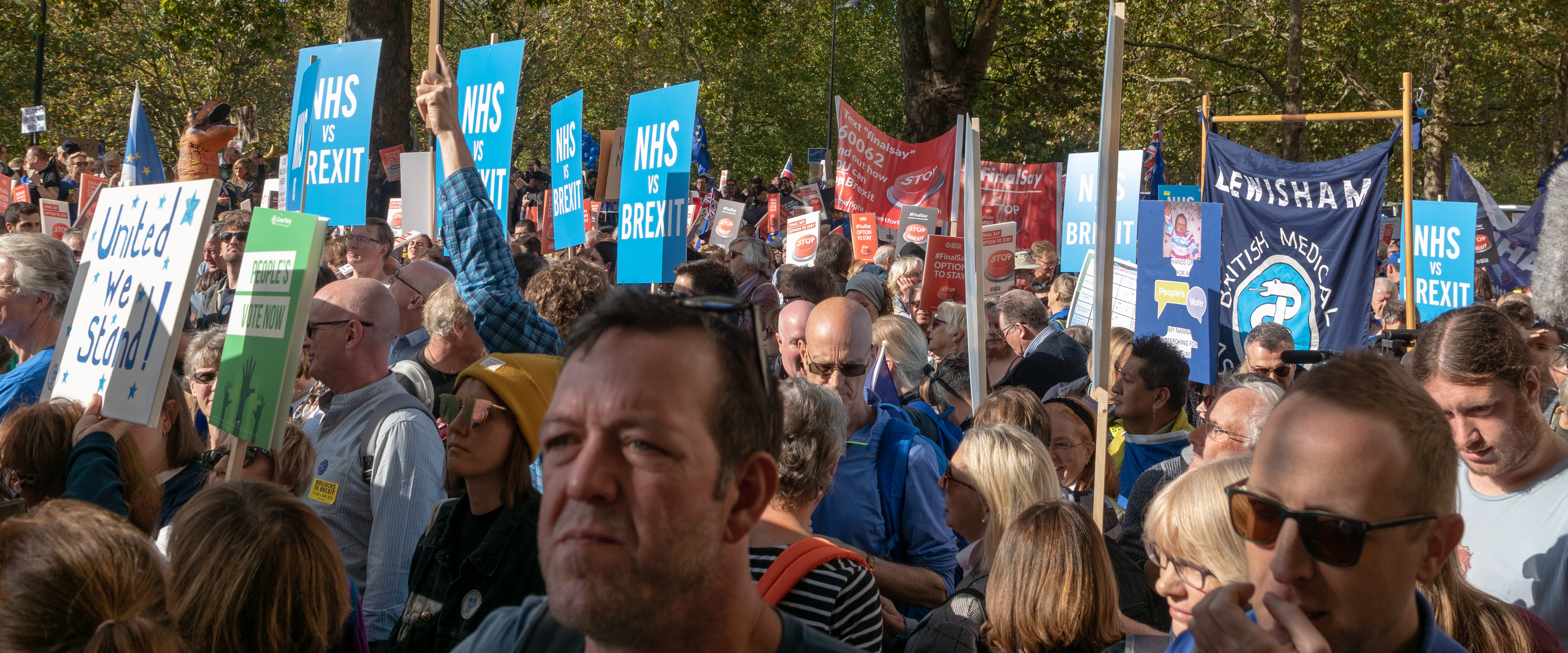
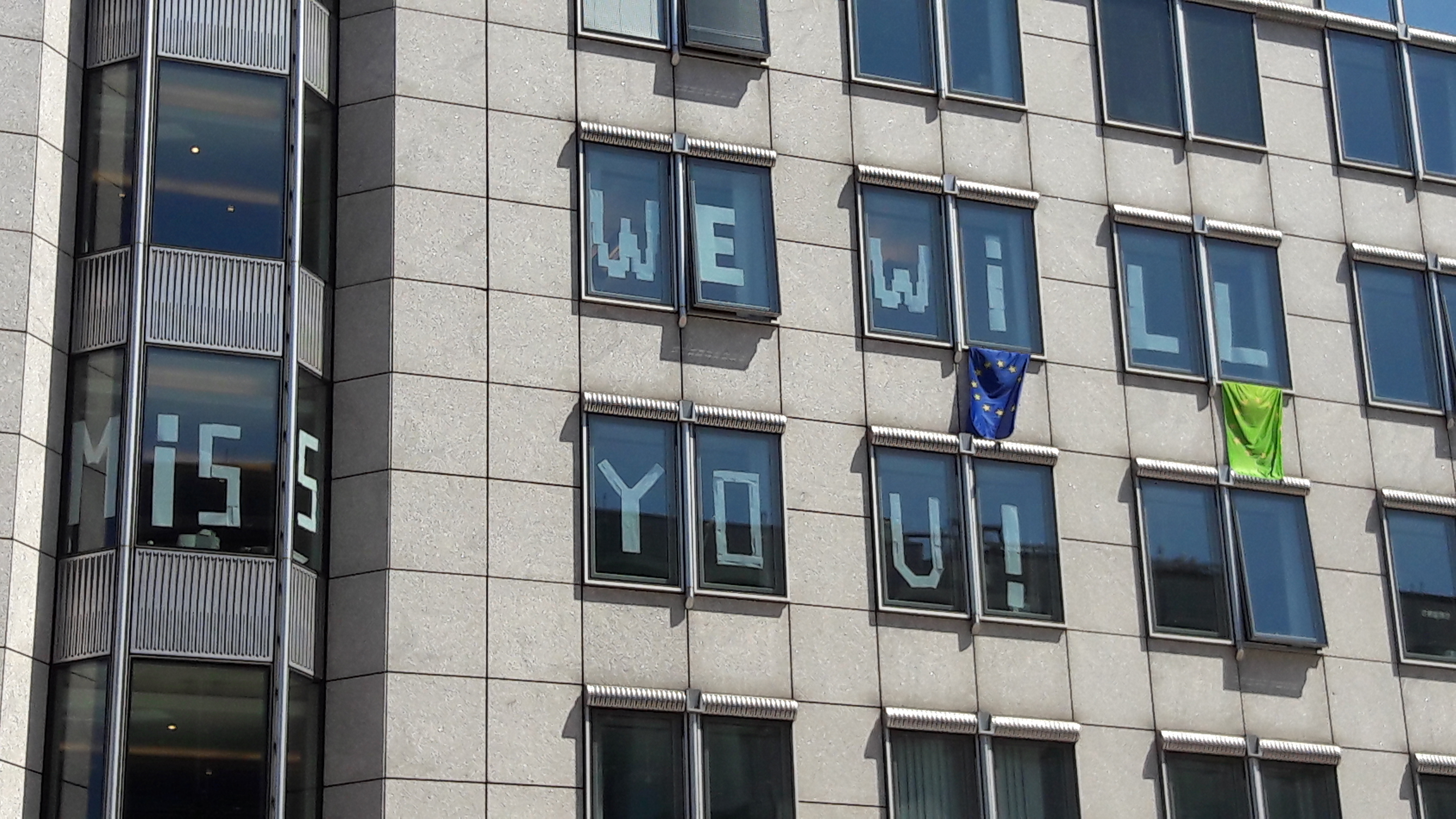
After the referendum result, Boston became the most-cited symbol of the Leave vote in national media coverage. BBC News, Sky News, and Channel 4 all ran features in the town in the days after the result. Interviews with Boston Leave voters were broadcast nationally and interpreted as representative of why Britain voted Leave.

The problem: Boston was the exception, not the rule. Its combination of high EU immigration and high Leave vote was unique precisely because its EU immigration was so visible. The majority of high-Leave areas had very little EU immigration. The immigration narrative — compelling and vivid in Boston — was being generalised to explain a phenomenon that, everywhere else, had almost nothing to do with immigration.

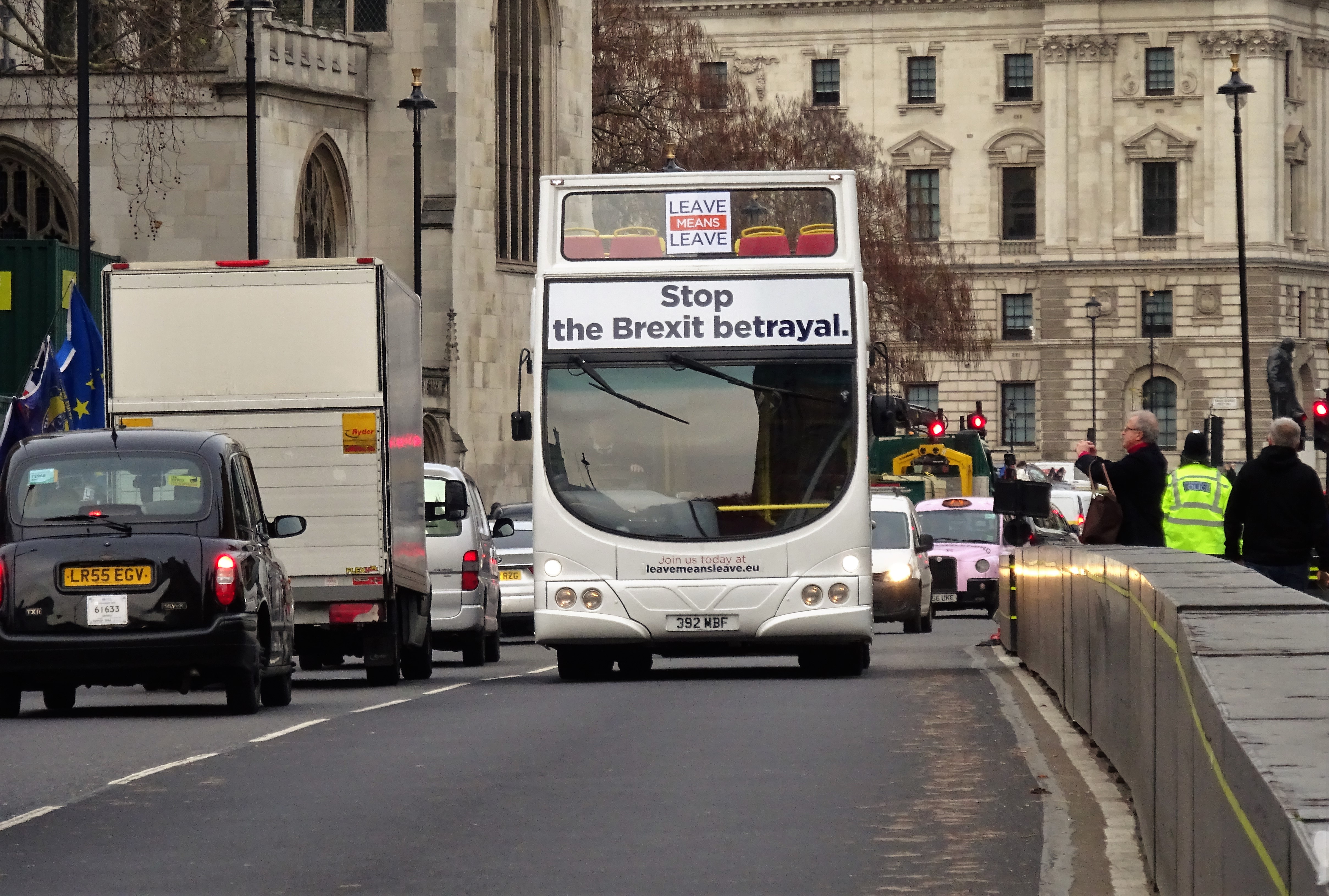
This media amplification locked in the incorrect causal narrative: "people voted Leave because of immigration." It crowded out the more accurate and more troubling story: "people voted Leave because a decade of austerity had left them with a legitimate grievance, and the campaign gave them immigration as the explanation."

The distinction matters enormously for policy. The "immigration caused Brexit" narrative implies that restricting immigration would have prevented it or would satisfy the underlying grievances. The "austerity caused Brexit" narrative implies that the underlying grievances remain intact — and have since been compounded by Brexit's own economic costs.

But even the word "austerity" can mislead, if it conjures only Treasury spreadsheets and GDP charts. The actual experience of the grievance was granular and daily. Middle England cities and towns were asking — not rhetorically, but in the ordinary course of life — why their local bus route had been cancelled. Why the swimming pool had been sold off, rebranded, and now cost twice as much to enter. Why the planning portal crashed every time you submitted an application. Why it took forty-five minutes on hold to speak to the council about a missed bin collection. Why Transport for London — with its Oyster card, its real-time apps, its frequent and comprehensible network — felt like a piece of infrastructure from a different country, available only to the people who happened to live where the money was.

This was not abstract. These were the touchpoints through which the state made itself legible — or stopped doing so. The decade after 2010 was the decade in which local government quietly stopped being something people encountered as a functioning service and became something they encountered as an absence: a closed library, a defunded youth centre, a website that told you to call a number that put you on hold. The grievance that Brexit crystallised was partly about trade exposure and public spending aggregates, but it was also about this: the daily experience of a state that had retreated, and left nothing in its place.

The relevant Brexit voter is not only the agricultural worker in Boston competing with EU labour. It is also the resident of a medium-sized English town watching the leisure centre close, the bus timetable shrink, and the council website fail — and being told, by a campaign with a red bus and a large number, that the explanation and the remedy were both the same thing: leaving the European Union.

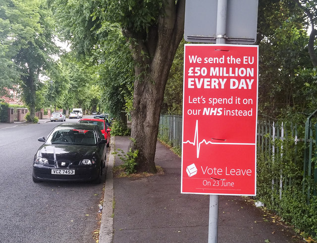
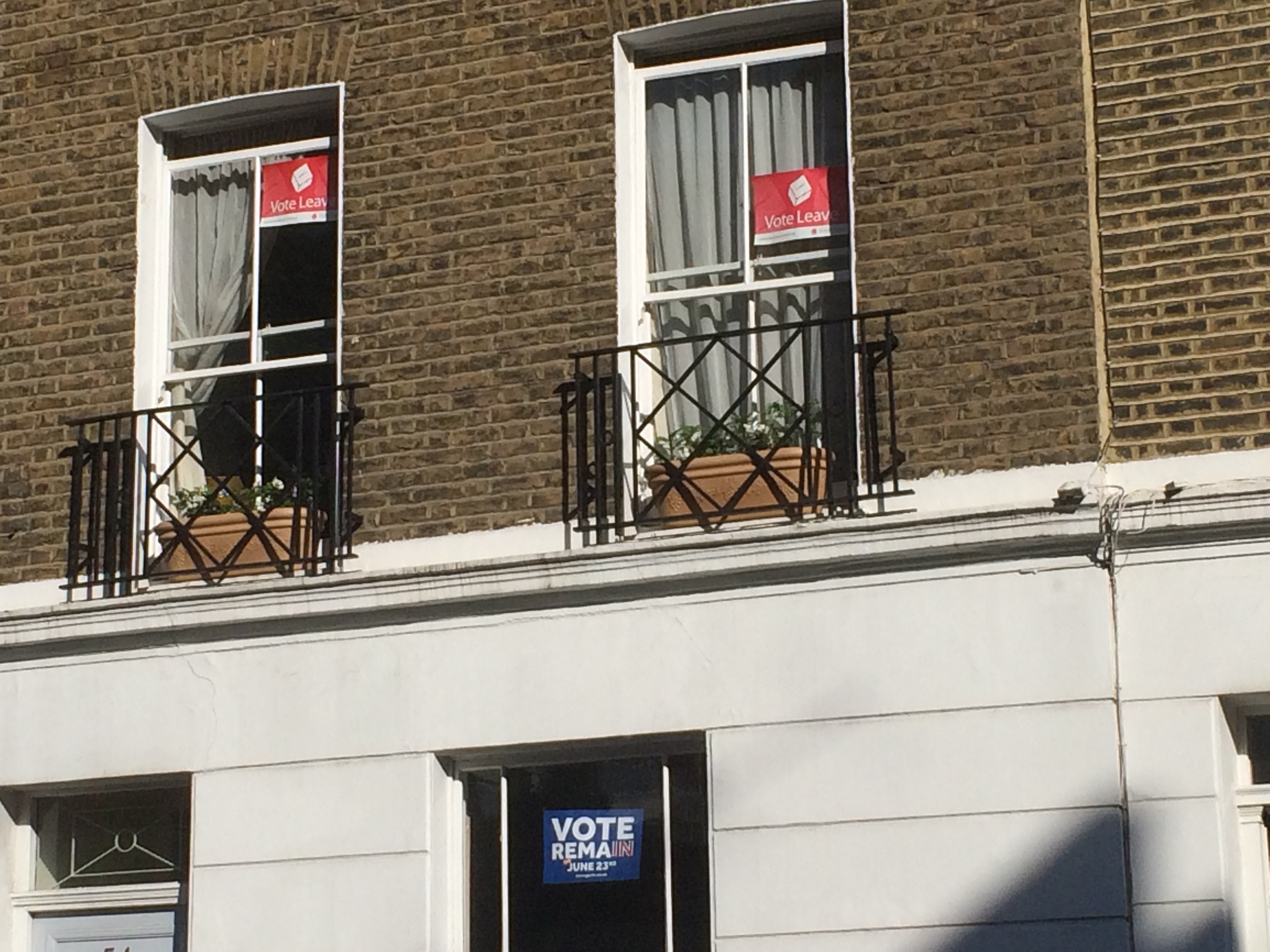
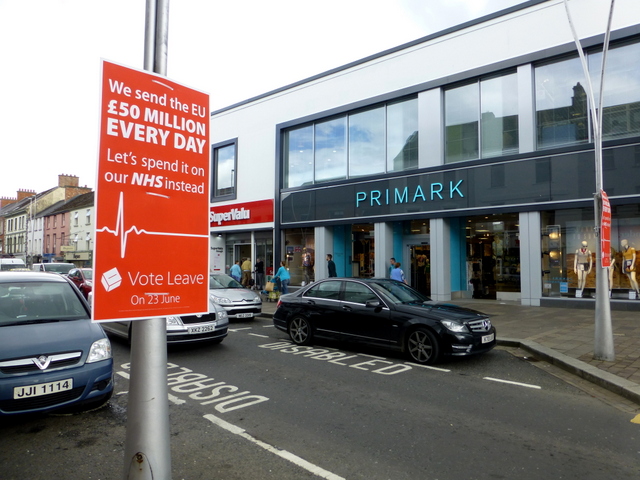
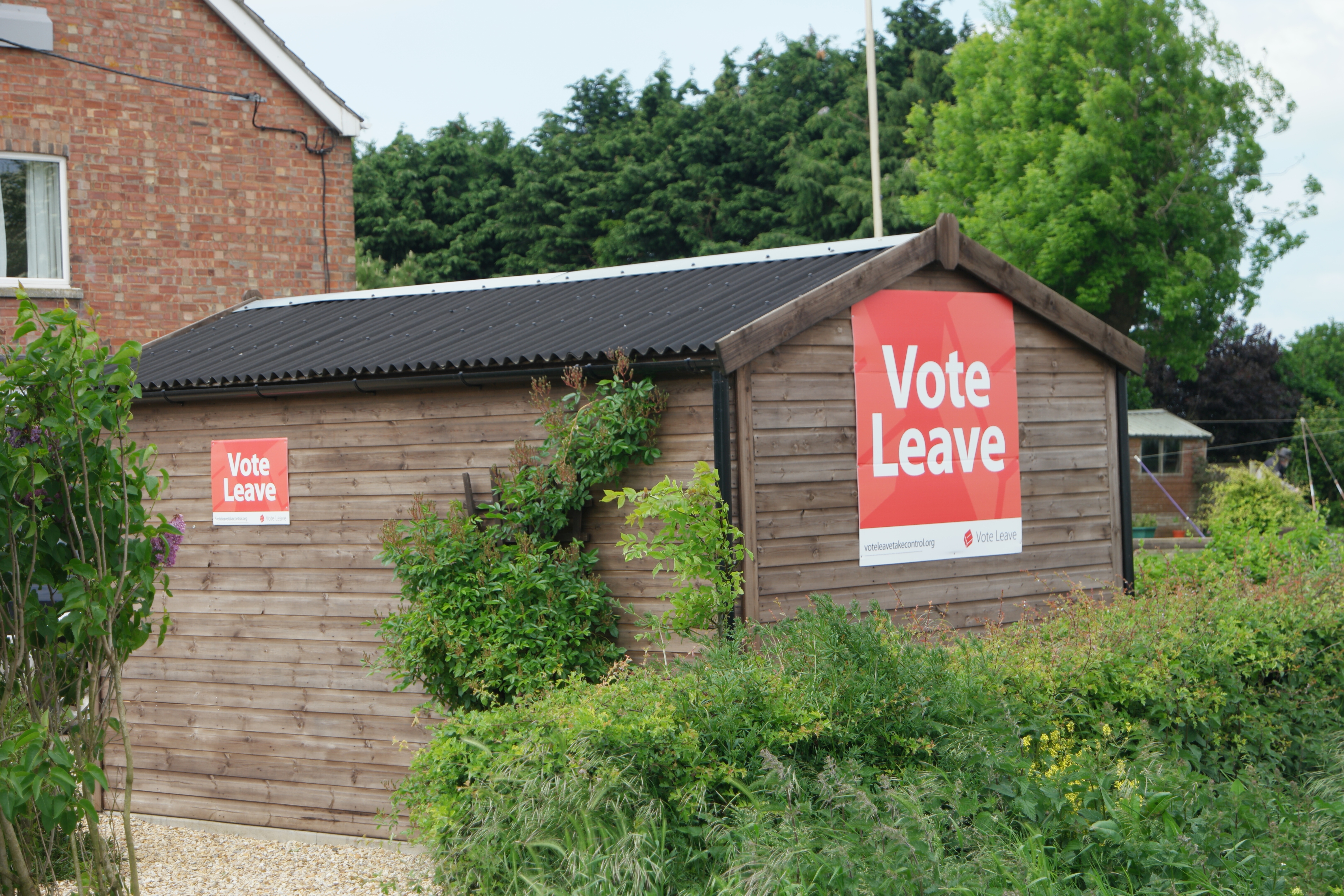
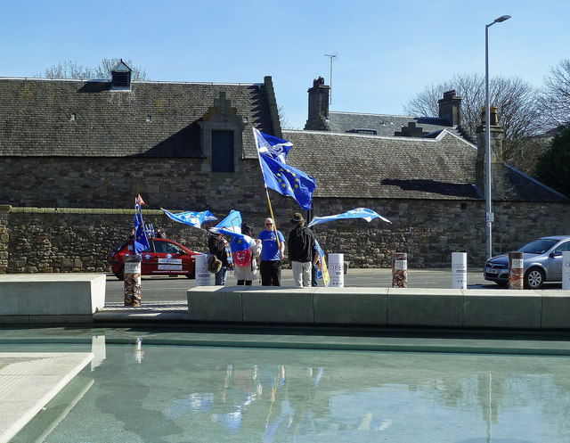
The Leave Vote in Rural and Small-Town England

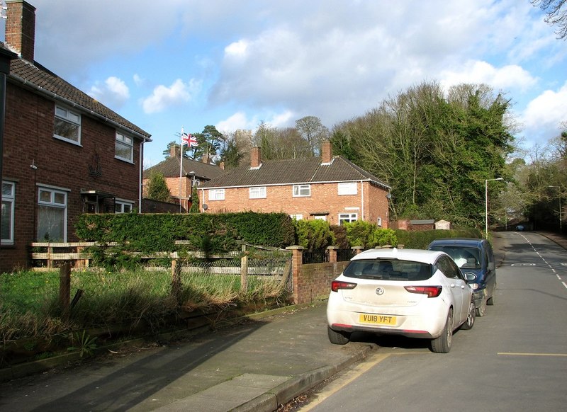
Boston's story — high immigration, high austerity, highest Leave vote — became the face of Brexit in national media. But most Vote Leave communities looked like this: small towns with visible decline and very little EU immigration.

Vote Leave sign in Belper

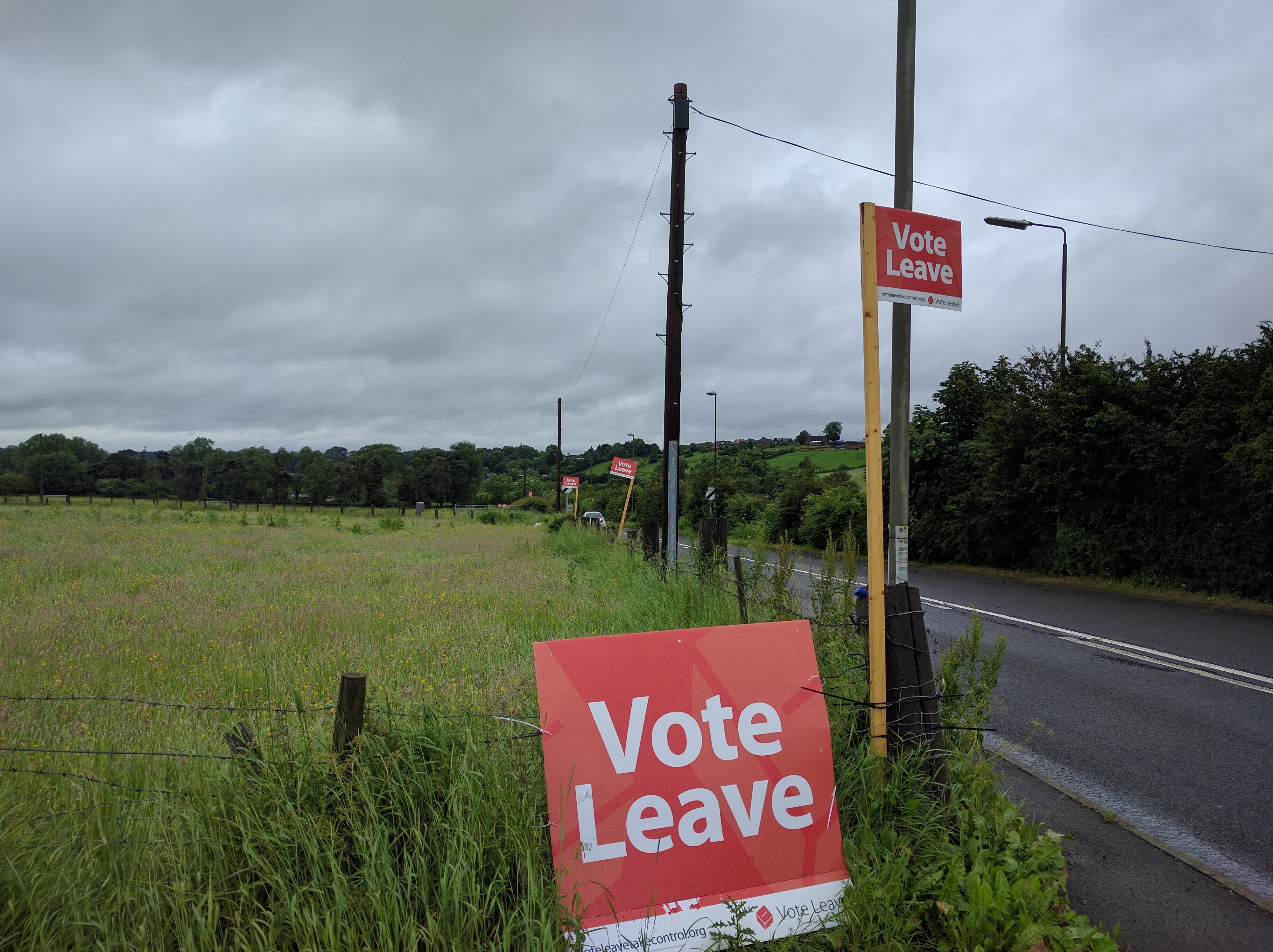
Vote Leave sign in Belper, Derbyshire. Belper is in an area with average EU immigration but high austerity exposure — more representative than Boston of the typical Leave community.
Wikimedia Commons

Will Brexit ever mean Brexit — Northumberland coastline

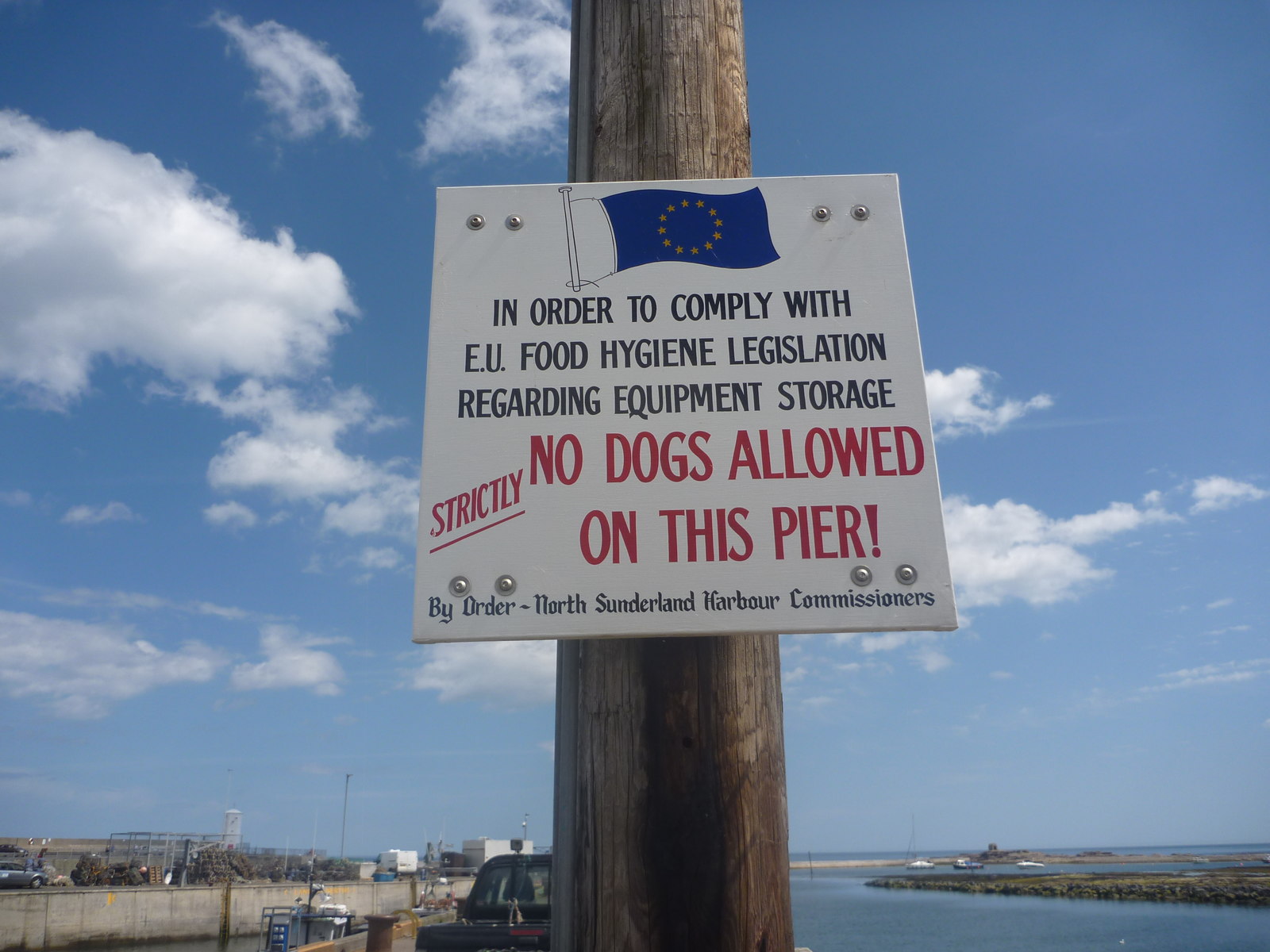
"Will Brexit ever mean Brexit?" — a question painted on a coastal wall in Northumberland, a region with high austerity and low EU immigration
Wikimedia Commons

2017 June

The Election That Hardened Brexit

Theresa May called a snap election in April 2017, expecting to convert her slim inherited majority into a commanding mandate for Brexit negotiations. The UKIP coalition that had reshaped British politics in 2013–15 had now served its purpose — the referendum had been won — and its voters were looking for a new home.

The UKIP vote collapsed from 12.6 % in 2015 to 1.8 % in 2017. Where did those votes go? The redistribution was uneven and — for May — fatal. In Leave-voting Labour heartlands, a substantial portion went to Labour under Jeremy Corbyn, who ran a genuinely radical domestic programme that addressed the economic anxiety underlying the UKIP vote. In more Conservative-leaning areas, UKIP votes went to the Conservatives. But the net seat effect was devastating.

The FPTP paradox, second edition: Labour's gains concentrated in urban seats already safely Labour. Conservative gains in traditional seats were insufficient to offset unexpected losses in university towns and some northern constituencies where Corbyn mobilised younger voters and former UKIP supporters simultaneously. The Conservatives lost 13 seats. Their majority evaporated.

May needed to form a minority government with a confidence-and-supply deal with the Democratic Unionist Party (DUP). This arrangement, combined with the paper-thin majority, meant that a bloc of 28–35 hardline Conservative Eurosceptics — the European Research Group (ERG) — now held genuine veto power.

2017: UKIP Collapses, Parliament Hangs

UKIP's vote fell from 12.6% to 1.8%. The redistribution left May without a majority. An anti-Brexit protest in Edinburgh, March 2017 — weeks before May called the snap election.

Brexit protest outside Holyrood, Edinburgh 2017

Brexit protest outside Holyrood, Edinburgh — March 2017. Scotland voted 62% Remain; opposition to Brexit was the defining political force.
Wikimedia Commons

Leave Means Leave bus outside Parliament, 2018

"Leave Means Leave" campaign bus outside Parliament, December 2018 — ERG-aligned activists maintaining pressure for the hardest possible Brexit as May's deal faced its first defeat
Wikimedia Commons

2017 result vs expectation: May called the election with a 20-point poll lead. She finished with a 2-point lead, losing 13 seats, losing her majority. UKIP's 10.8pp drop redistributed partly to Labour (+9.6pp), partly to Conservatives (+5.5pp) — but the seat geography favoured neither side.
2017–2019

Parliamentary Deadlock: May's Trap

May was caught in an impossible trap. The DUP would not accept any arrangement that created a regulatory or customs divergence between Northern Ireland and the rest of the UK — this meant the Irish backstop was politically untenable. The ERG would not accept any arrangement that kept the UK bound by EU customs or regulatory rules — this meant a Norway-style soft Brexit was equally untenable.

May's withdrawal agreement was rejected by parliament three times — by margins of 230, 149, and 58 votes — the largest legislative defeats in modern British history. Each rejection hardened the political reality: only the most maximal Brexit was politically viable for the parliamentary arithmetic.

Boris Johnson's solution — accept the Northern Ireland Protocol (a de facto customs border in the Irish Sea, separating Northern Ireland from Great Britain in regulatory terms) and call it "getting Brexit done" — was only possible after securing his own 80-seat majority in December 2019. The hard Brexit that resulted was not the inevitable consequence of the 52–48 referendum result. It was the product of two FPTP electoral accidents, a minority government, and a constitutional veto by a small parliamentary bloc.

Parliament vs. Brexit: The Constitutional Crisis

May's deal was defeated three times. The People's Vote campaign mobilised millions. Boris Johnson's December 2019 majority finally broke the deadlock.

Brexit vote in Parliament, 15 January 2019

Outside Parliament on 15 January 2019, the night May's deal was rejected by 230 votes — the largest parliamentary defeat of a government in modern British history
Wikimedia Commons

People's Vote march in Parliament Square

People's Vote march in Parliament Square — one of the largest political demonstrations in British history, calling for a second referendum
Wikimedia Commons

People's Vote march — NHS vs Brexit banner

"NHS vs Brexit" — the People's Vote march reframed the debate: was Brexit worth the cost to public services?
Wikimedia Commons

Anti-Brexit campaigners at Westminster

Anti-Brexit campaigners at Westminster, 2018 — the parliamentary impasse created space for sustained public mobilisation
Wikimedia Commons

2019 December

FPTP Round Three: The Brexit Party Gambit

Nigel Farage's answer to the parliamentary deadlock was to found yet another party. The Brexit Party — launched in February 2019 — won 29 seats in the European Parliament elections just months later, becoming the UK's largest party in Brussels. It was a national brand built almost entirely through social media, requiring no prior organisational infrastructure: the internet had solved the collective action problem that historically made single-issue parties impossible under FPTP.

When Boris Johnson called a general election for December 2019, Farage faced the classic FPTP dilemma: field candidates everywhere and split the Leave vote, handing seats to Remain-aligned parties; or deploy strategically. He chose deployment. The Brexit Party stood down in all 317 Conservative-held seats, removing any risk to incumbent Tories. But they kept candidates in Labour-held seats — specifically in Leave-voting Labour heartlands across the Midlands, the North, and Wales.

The FPTP arithmetic, third edition: In marginal Labour seats in heavily Leave-voting areas, a Brexit Party vote of 5–8% was enough to drag Labour below the winning threshold. The Conservatives gained 47 seats from Labour — on swings that were, in many constituencies, smaller than the Brexit Party's local vote share. Without the Brexit Party's selective presence in those seats, the mathematics would not have delivered Johnson his majority.

The mechanism was the same as 2013–2015, but now operating in reverse: instead of using FPTP to punish Conservatives into holding a referendum, Farage was using it to reward Conservatives who would deliver the hardest Brexit. A nationally-branded, socially-networked, single-issue candidacy — requiring no deep local organisation, just enough presence to move the marginal vote — had become the decisive instrument of British constitutional change for the third time in six years.

Johnson's 80-seat majority ended three years of parliamentary paralysis. But it was not a majority built on a surge of Conservative support — the Conservative vote share rose by only 1.2 percentage points from 2017. It was a majority built on the systematic exploitation of FPTP's core vulnerability: that a nationally coordinated signal, delivered through social media at near-zero cost, can convert a modest national vote share into a decisive seat advantage by concentrating the effect in the marginals that decide governments.

2019–2020

Brexit Negotiations and the Shape of Departure

The UK-EU Trade and Cooperation Agreement (TCA), concluded on 24 December 2020, was the thinnest possible deal: zero tariffs and zero quotas on goods, but no mutual recognition of services, no equivalence for financial services, no freedom of movement, and comprehensive non-tariff barriers from rules-of-origin requirements, customs declarations, and regulatory divergence.

For the UK's service-dominated economy (80 % of GDP) the deal offered almost nothing. For manufacturing supply chains deeply integrated with EU production, it imposed new frictions immediately. For regions whose economies depended on EU-linked services exports — financial services in London, professional services in Edinburgh, creative industries in Manchester — the non-tariff frictions proved more costly than the headline zero-tariff commitment suggested.

The TCA was, by design, the outcome of a process shaped by the ERG's veto power and the Johnson government's political priorities. A softer Brexit — closer to Norway's EEA relationship, with regulatory alignment and freedom of movement — would have been less economically costly but was politically impossible given the parliamentary arithmetic that FPTP had created.

Northern Ireland: constitutional friction cushioned with cash

The Johnson settlement also sits inside a wider fiscal story: Northern Ireland was repeatedly stabilised with exceptional UK Government funding as Brexit exposed the unresolved problem of keeping an open Irish border while taking Great Britain out of the EU's customs and regulatory order.

  • 2017 — May, not Johnson: the DUP–Conservative confidence-and-supply deal supported Theresa May's minority government and came with an additional £1 billion over five years for Northern Ireland, including infrastructure, health, broadband, education pressures, deprivation and mental health.
  • January 2020 — Johnson's New Decade, New Approach: Johnson's government committed around £2 billion to support the restored Northern Ireland Executive and public services.
  • December 2020 — post-transition implementation: the UK announced a further £400 million Northern Ireland package, on top of £650 million already announced for trader support, technology and PEACE Plus contributions.

Sources: House of Commons Library, confidence-and-supply £1bn; UK Government, £400m post-transition package.

Brexit Negotiations and the Shape of Departure

Johnson's "Get Brexit Done" election majority in December 2019 ended the parliamentary stalemate. The Trade and Cooperation Agreement, concluded on 24 December 2020, was the thinnest possible deal; in Northern Ireland, the constitutional friction was accompanied by substantial UK fiscal support.

Boris Johnson Get Brexit Done campaign, 2019

Boris Johnson's "Get Brexit Done" campaign. His 80-seat majority in December 2019 ended three years of parliamentary paralysis — and locked in the hardest available Brexit.
Wikimedia Commons

HM Government Get Ready for Brexit campaign

HM Government "Get Ready for Brexit" campaign — October 2019. The £100m public information campaign was a measure of how unprepared businesses and individuals were for the practical consequences.
Wikimedia Commons

Brexit Day flag, Sandy Lane, Norwich, 31 January 2020

Union Jack flown in Sandy Lane, Norwich on Brexit Day — 31 January 2020. The UK formally left the EU. The transition period ended 31 December 2020.
Wikimedia Commons

Post-Brexit blues, European Parliament

UK MEPs leaving the European Parliament after the final plenary session, January 2020
Wikimedia Commons

2016 – present

The Reckoning: Leave → Cost

Synthetic control method (SCM) counterfactual estimates show substantial cumulative GVA losses, largest as a share of regional income in the most deprived areas — those that voted most heavily for Leave. The chart on the right (Panel E) shows this directly: Leave vote share on the x-axis, Brexit cost on the y.

The "levelling up" promise became a levelling down reality. The communities that were told Brexit would redirect money from Brussels to their public services have instead seen a decade of austerity compounded by a decade of post-Brexit underperformance. The cumulative gap between UK performance and the synthetic control counterfactual continues to widen.

The full causal chain is now visible and evidenced. Austerity created the anger. The Mediterranean crisis provided the imagery. FPTP in 2015 created the referendum. FPTP in 2017 hardened its outcome. The Brexit Party in 2019 locked it in. The communities that voted most emphatically for change got the least of it.

Brexit has reduced the economic pie for the country as a whole. It has reduced the fiscal space and reduced the ability to level up. In relative terms, the Brexit-voting regions may feel vindicated — but on average, the country as a whole is poorer. The end result: more disgruntlement and more instability.

This matters beyond Britain's borders. Russia's war in Europe, aggression from the US under Donald Trump, an assertive China, and the accelerating climate crisis make it all too transparent that shared challenges are best tackled as a team. The Brexit experiment has made that lesson more costly to learn.

E. Leave vote → Brexit cost

Leave vote share % (x) vs Brexit cost as % GVA (y, positive = more loss). Each bubble = a local authority; size ∝ √GVA 2016; colour = Brexit gap (red = larger loss). The upward slope is the central finding: those who voted most for Leave have paid most.

LAD E07000228

What happened since Brexit?

Context and local drivers for Mid Sussex.

Mid Sussex
What happened since Brexit?

Mid Sussex

Openness to trade and Brexit

To assess the economic impact on Mid Sussex, a first natural consideration is the extent to which the region may have been impacted owing to its openness to trade. We compute the cumulative losses post 2016, also in a version excluding the pandemic years of 2020 and 2021, and plot the relative output loss relative to 2016 GVA against a measure of local trade openness based on subnational trade data first published in 2019.

Trade openness and Brexit's estimated economic cost

Why start here

To assess the economic impact on Mid Sussex, a first natural consideration is the extent to which the region may have been impacted owing to its openess to trade. We compute the cumulative losses post 2016, also in a version excluding the pandemic years of 2020 and 2021, and plot the relative output loss relative to 2016 GVA against a measure of local trade openess based on subnational trade data first published in 2019.

We see that, on average, regions with more trade exposure exhibit higher output losses. As we move to more granular regional definitions, owing to measurement noise, the correlations do get weaker, but the pattern suggests that trade openess is not unrelated to the size of the output loss.

We see that, on average, regions with more trade exposure exhibit higher output losses. As we move to more granular regional definitions, owing to measurement noise, the correlations do get weaker, but the pattern suggests that trade openness is not unrelated to the size of the output loss.

This is not unexpected: Brexit is, what economists call, a terms-of-trade shock — it created frictions in the UK’s most significant trade relationship. The European single market, in which the UK was a member until the start of 2020, had effectively removed barriers to trade.

Brexit reimposed many of these barriers which, as a result, drove up the cost of trade. This is particularly consequential for the many value chains that criss-cross the European continent.

Changes to trade in Mid Sussex

A key promise of Brexit was for the UK to regain its ability to negotiate trade deals with other, potentially faster growing countries or regions. Further, there is and was hope that trade in the future may be much more shaped by services—not goods—trade. We do see that, on average, the UK’s trade in services has grown.

How did Mid Sussex trade evolve since Brexit?

From 2019 to 2023, Mid Sussex’s total trade rose modestly, with gains led by EU goods and non-EU services rather than a single broad-based upswing.

Total trade increased from £11,588m in 2019 to £12,360m in 2023, a rise of £772m or about 6.7%, so the overall pattern is one of moderate nominal growth rather than decline. Looking across the main channels, EU goods trade rose from £3,328m to £4,042m (+£714m), non-EU goods trade fell from £3,445m to £3,313m (-£132m), EU services trade fell from £2,432m to £1,993m (-£439m), and non-EU services trade rose from £2,383m to £3,012m (+£629m). This points to a mixed pattern: goods growth was concentrated on the EU side, while services growth came from non-EU markets, with weakness in EU services and non-EU goods partly offsetting those gains. That mix does not look like a simple across-the-board EU retreat or non-EU substitution story. Instead, it suggests a rebalancing within trade: goods became more EU-facing, while services became more non-EU-facing. Overall EU trade still rose slightly (+£275m), but non-EU trade rose more (+£497m), nudging the total trade mix a little toward non-EU markets. At the same time, trade openness was broadly flat to slightly lower relative to GVA, which helps explain why rising nominal trade values sit alongside a weaker production-side picture. The estimated Brexit effect points to a persistent negative GVA gap by 2023, with output materially below the synthetic comparison, so the trade data are more consistent with adaptation and compositional change than with a strong trade-led improvement in local economic performance. Mid Sussex’s sector profile may help explain this mixed outcome. The provided context highlights agriculture, accommodation and food services, and financial and insurance activities as standout sectors, and flags agriculture/food, hospitality, and finance/professional services as Brexit-sensitive. That is consistent with uneven channel performance across goods and services rather than a uniform response. Important caveats remain: these trade values are nominal, so inflation and exchange-rate movements may inflate measured trade even where real volumes were weaker; the 2019-2023 window also spans pandemic disruption and recovery; and the trade estimates for Mid Sussex are inherited from the ITL3 level rather than directly measured for the LAD, so they should be read as indicative of local exposure rather than a precise local trade account.

📦EU vs non-EU trade growth, 2019–2023

How EU and non-EU goods & services trade evolved relative to 2016 GVA — x-axis: EU trade growth, y-axis: non-EU trade growth. Regions above the diagonal diversified away from the EU.

Bubbles:All regionssize ∝ √GVA 2016
EU/non-EU trade scatter covers ITL1/2/3 only; point shown is for parent ITL3

Immigration and Brexit

Immigration is another important dimension around Brexit. In the run up to the EU referendum, many populist UK politicians adopted an explicit anti-immigration narrative. The promise to voters was that once the UK is outside of the European Union, there would be no more freedom of movement. The UK would take control over its national borders and, so the implicit understanding may have been, reducing the influx of immigration.

The contrary has happened. The UK has seen an unprecedented increase in immigration post 2020 with net international migration peaking at 944,000, being nearly three times the previous record. The UK’s new immigration scheme, which the UK could have adopted even before Brexit, is often credited for this sharp increase.

At the same time, there was significant domestic migration and displacement. Areas in the UK with significant internal net migration are typically not the places that receive significant international migrants. While the underlying causal factors may be manifold, this clearly can set up sharp anti-immigration narratives if domestic migrants perceive displacement from international migrants.

✈️Internal vs international net migration (post-2021)

Net internal displacement (x) vs net international arrivals per capita (y). Regions in the top-left gained international migrants while losing residents internally.

Bubbles:All regionssize ∝ √GVA 2016

How was Mid Sussex affected by immigration since Brexit?

Migration in Mid Sussex looks large enough to matter locally, with a mixed but internally led pattern and a substantial share of the net gain occurring after 2020, so it could have cushioned some Brexit-related weakness without establishing a causal offset.

Mid Sussex is assessed as a Brexit loser on GVA, with a persistent output shortfall relative to its synthetic comparison, but local migration flows are sizeable enough that they plausibly matter for interpretation. From 2016 to latest, net total migration was 13,731, equal to about 9.3% of the 2016 population, which is high relative to typical areas in the reference distributions and above the median for comparable local authorities. The pattern appears mixed rather than purely international: net internal migration was 10,003 (6.8% of the 2016 population) and net international migration was 3,728 (2.5%). That suggests population inflows may have supported local demand and labour availability even while output underperformed. The post-2020 period looks especially important. From 2020 to latest, net total migration was 10,575, around 7.0% of the 2020 population, and this accounts for a large share of the post-2016 net change. Net international migration after 2020 was 4,008, which is slightly larger than the full post-2016 net international total, while net internal migration after 2020 was 6,567, so both components remained material and the overall pattern stayed mixed with internal migration still larger in absolute terms. In that context, migration could have buffered some of the estimated Brexit effect through labour supply, consumer demand, housing demand, pressure on local services, and possibly the local tax base or fiscal capacity. The fall in economic inactivity from 19.6% in 2016 to 18.2% in 2024 is consistent with a labour market that may have absorbed some of this change. But this remains contextual rather than causal evidence: migration flows do not show that Brexit losses were offset, only that population and labour-market dynamics may have complicated how those losses appeared in local output and income measures.

LAD E07000228

Robustness

Testing whether the divergence is robust to donor-pool choice, treatment window, and placebo comparison.

Metric
Treatment window

Sensitivity to donor-pool choice

Observed levels against alternative donor-pool synthetic fits.

Observed level against all candidate synthetic paths, shown from 2005 onward.
Each point is a donor-pool specification. Lower pre-treatment RMSPE is better; more negative post-treatment average gap implies a larger shortfall.

How to read donor-pool sensitivity

The left chart asks whether the observed path remains separated from a wide range of plausible synthetic benchmarks when the donor pool changes. The dropdown highlights one donor-pool family at a time, while the full set of grey lines shows the total design space tested.

The scatter plot summarises the same candidate set in two dimensions: pre-treatment fit on the x-axis and average post-treatment percentage gap on the y-axis. If highlighted donor pools cluster in the lower part of the chart while still fitting well before treatment, the result is less likely to be driven by a single arbitrary donor-pool choice.

Placebo-fits for significant donors

True placebo gap paths and their distribution from the robustness exports.

Gap paths on the SCM estimation scale for placebo units that pass the robustness filter, alongside the treated unit.
Distribution of placebo robustness statistics with the treated unit marked for reference.

How to read the placebo comparison

The placebo exercise carries out fake Brexit experiments in a donor universe and compares how, within this donor universe, the UK synthetic control would evolve relative to the synthetic-control estimate for the fake Brexit. Since we are constructing a large set of synthetic-control estimates, 31 for each potential donor-pool set configuration and different spatial granularities, doing this for all would be computationally infeasible.

Rather, we construct a restricted candidate set of potentially informative placebos that pertain to donors that are active donors across these donor-pool configurations. In these restricted placebo runs, an active donor does not simply mean a place that received a large synthetic-control weight in one model. It means a place that looked relevant to the counterfactual construction under a broader set of rules, including repeated appearance across admissible donor-pool specifications and support-based placebo diagnostics. The restricted donor universe should therefore be understood as a support-informed subset of plausible comparison places, not just the set of donors with visibly large weights in a single best-fitting specification.

Placebo-weighted fit. The pre-Brexit placebo-weighted fit uses a fake treatment date before the referendum, here a post-2012 placebo, to evaluate how well different synthetic-control specifications behave when no Brexit effect should yet be present. We take the same candidate donor-pool models that could later be used for the real post-2016 or post-2020 analysis and ask which specifications produce the smallest spurious gaps over the following pre-Brexit years when no such difference should arise. Those placebo-period errors are then turned into weights, so specifications that generate smaller false effects in the pre-Brexit placebo window receive more weight in the final ensemble.